A perfect symbiosis of luxury and spatial segregation
Draped in elements of luxury the duplex home in Kolkata designed by D’zine Forum also showcases a clever segregation of spaces says Mandeep Manchanda, Principal Designer, D’zine Forum
Where is this project based?
The project is based in Streetwood, Kolkata
What was the client brief when he approached you with the project?
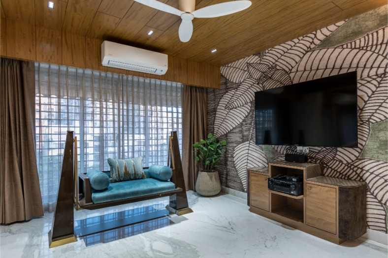
The client was clear he wanted a touch of luxury, to make the most of the dramatic empty space. The design element was to be maintained as modern luxury, creating a space that’s thoughtfully designed but not ostentatious.
Can you tell us about the spatial integration and the flow of spaces in the property?
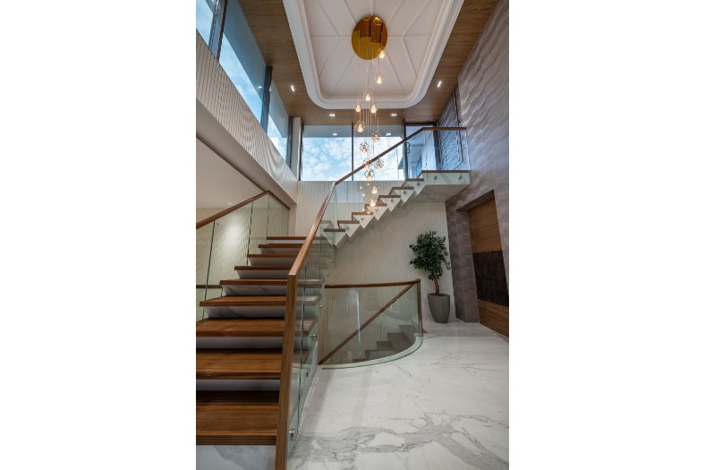
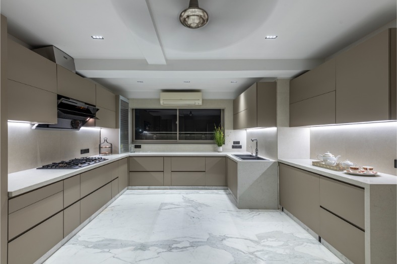
The duplex home comes with double height ceilings and with it comes larger surface areas on the walls. The double height wall was intricately designed using solid surfaces with the flute concept. When a home is divided into two halves, there is a need to bring the entire space together. A living space was designed which served as the heart of the apartment for the family to gather around at the end of the day. The living floor has a single bedroom which is the parent’s room and the entire floor holds the living, dining and kitchen spaces.
Last but not the least is the bar area with the extended terrace to it. The stylishly designed rooftop terrace has all the trappings and comforts of a living room inside the house such as cane sofas, wall art, lighting. To make the rooftop feel more like a secluded garden retreat, the double height wall was treated with wooden finish tiles with hung planter boxes. A good form of uniformity or fluidity was maintained while planning the style aesthetic of their space.
What are some of the finer design aspects of the parent’s room?
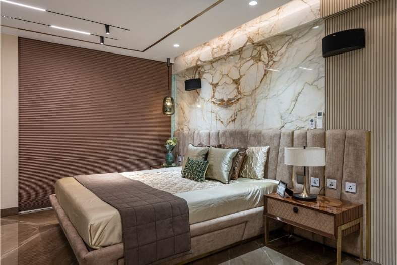
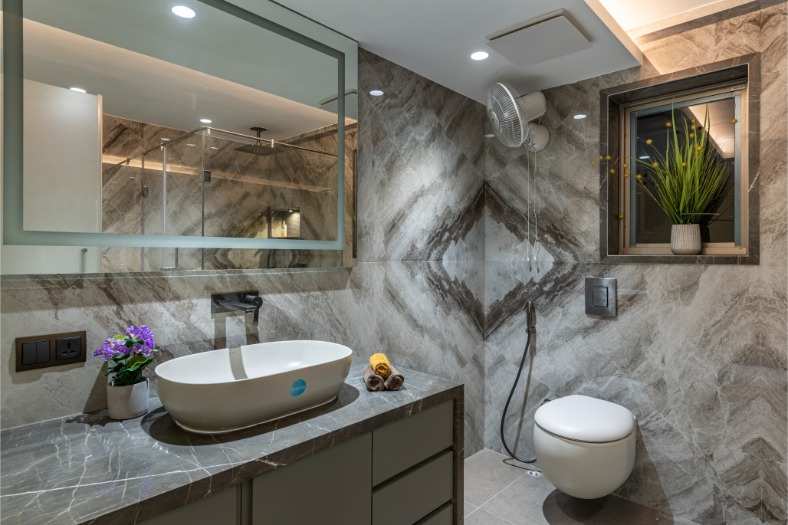
As you walk in the parent’s room you will see the sleeping area and the room is adjoined with a walk in closet. This space is distinctly framed by an accent wall that is created using CNC cut stone work. One of the conclusively designed rooms in this duplex is the master bedroom. The bedroom has an adjoined walk-in closet and the bathroom is adjoining to the main bedroom with a transparent glass wall in between. The glass wall was used to maintain the length of the room and Italian marble look was continued from the back of the bed to the bathroom.
What are some of the key features of the kids room?
A kid’s room is quite different from that of an adult. Their bedroom is their hibernating space. Considering they spend so much of their adolescent life in this room that practically contains their world, this space should be comfortable and functional, with a fun personalized element to it. The kid’s room was divided into three parts. The main bedroom has twin beds with a bright superhero wallpaper at the back. The reading corner is the main highlight of the room. The study was interestingly designed with minimum storage.
Cookie Consent
We use cookies to personalize your experience. By continuing to visit this website you agree to our Terms & Conditions, Privacy Policy and Cookie Policy.


