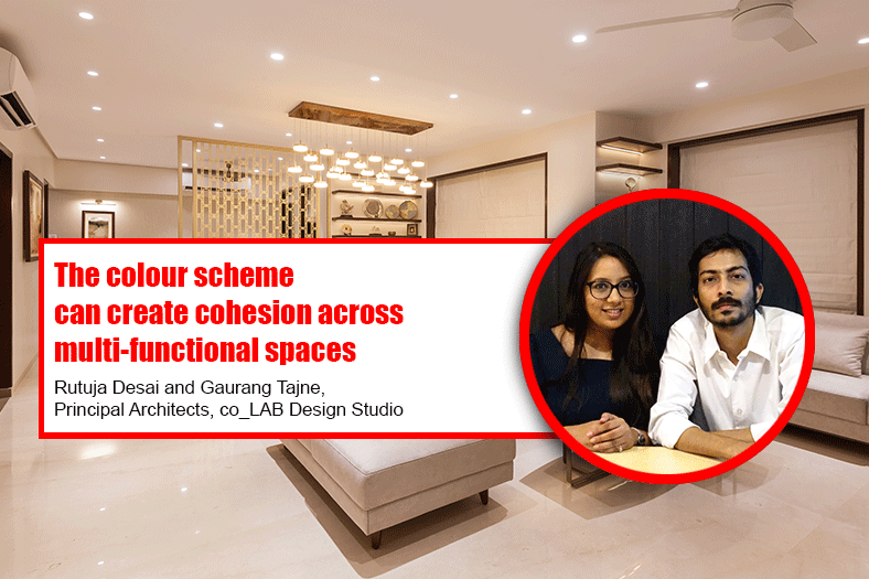
The colour scheme can create cohesion across multi-functional spaces

Through colour, you can create a design that has a visual relationship between different spaces. You can also use this idea to create a visual relationship throughout an entire house or in a stand-alone space say Rutuja Desai and Gaurang Tajne, Principal Architects, co_LAB Design Studio.
How does colour affect the psyche and the aesthetics of a given space?
Colours are a standout amongst the essential things enveloping us from a style perspective. They can change the point of view, control measurements and even inspire emotions if utilized right. In the same way, the colours are impacting our intuitive and activities, responses; they could raise your pulse or even smother your ravenousness. Colours can be utilized as a part of different routes on an ordinary premise to control the view of a thing or business brand.
Despite offering character to space, colour is likewise valuable in affecting human behaviour, choice-making, health, and substantially more with or without our acknowledgement. As such, colour is an unpretentious incitement with a striking effect that has been very influencing human lives physically, mentally, physiologically, and sociologically.
In the case of smaller spaces, what kind of colours can be used to make it look voluminous?
A small space can conjure up a huge impact. Clever use of colour can help make the most out of every square inch. Warm neutrals or off-whites have a softer hue that gives ambiance and warmth to a room. One of our favourite go-to colours is morning glory, a subdued tone that is adequately neutral. One could also use cooler-toned neutrals when painting and decorating other rooms to create a subtle yet noticeable contrast.
This colour scheme also makes it much easier to find complementary decorations and accessories. It goes well with almost every furniture and texture. Also, sticking to painting all details like skirting, architraves, cornices, window frames, and even ceilings in the same colour reduces visual clutter, therefore giving larger volumes to any space. By painting and decorating this way, you will avoid breaking up the room into sections and create a seamless look throughout.
How does the colour strategy differ in residential spaces vis a vis office spaces and restaurants? Colour strategy in interior design is simply the organization and choices of colours placed throughout a space. One of the most popular design choices over the last few decades is utilizing an open floor plan for the public spaces in a home. The colour scheme for a room can create cohesion across multifunctional spaces. Through colour, you can create a design that has a visual relationship between a dining room, living room, and kitchen in a single area. You can also use this idea to create a visual relationship throughout an entire house or in a standalone space.
Restaurant interior colours should be chosen with care and should be in sync with the restaurant’s theme and concept. Studies have shown that interior colours can impact the psychology of customers, making them subconsciously react in many ways ranging from affecting the food choices of customers to the amount of money they spend. Different colours stimulate different emotions and can profoundly impact feelings of hunger, thirst and comfort in people.
Colour influences productivity. As bizarre as it may seem, your office space can slow you down. For example, grey-coloured common areas can be calming and can have a depressing effect on you. Red can over stimulate your mind causing you to lose concentration or, it can fuel excitement. A yellow meeting room can cause anxiety or instill happiness.
There is no one right colour, as they all have different psychological results. You have to establish what your goals and needs are for your office. Knowing this and depending on your line of work will help you choose the colours best suited for your space. If you are a designer, you might opt for a more vibrant and funkier colour scheme. If you are in marketing and sales, you might go with lighter tones. If you are a lawyer, grey and white colour schemes might be positive for professionalism.
When it comes to interiors as also exteriors, what kind of paints are preferable to achieve optimum result in terms of beauty, aesthetics and longer shelf life?
No matter what the project is when it comes to selecting paints for interiors as also exterior factors such as durability, low VOCs, dry time, weather resistance, climate suitability, and surface suitability play a vital part. Paint with a 15-year warranty is likely to be more durable than paint with a five- to 10-year warranty. Chemicals and solvents found in paint products can emit toxic fumes known as volatile organic compounds (VOCs).
Paints labelled as “Low-VOC” or “ZeroVOC” shall be preferred over oil-paints or latex-based paints that are higher in VOCs. Paint needs to vary by region or weather conditions in that area. Low-quality paints contain cheap pigments that tend to fade over time, especially if the painted surface has a southern exposure and receives direct sun or rain. Dark colours are more likely to fade than light hues in such areas. One can efficiently increase the longevity and aesthetics of your space by keeping the above things in mind before choosing your paint.
Cookie Consent
We use cookies to personalize your experience. By continuing to visit this website you agree to our Terms & Conditions, Privacy Policy and Cookie Policy.


