We prioritise functionality over aesthetics
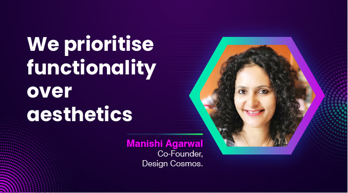
“We design an affordable and delightful environment for our clients to unwind.”
The project serves as the office for the construction sector, with intentions to enter the real estate market soon. In light of this, we decided to design a modern and durable workplace. The goal is to set an example, and many strategies have been used to reduce the building’s energy usage because going sustainable is urgently needed. A few examples are the use of solar panels to produce electricity, separate electric metres for HV and LV, louvres on the façade to control sun penetration within the building, DGU glass on the façade, rainwater collection, and the use of more than 70 percent recycled materials inside the structure. Maximum use of natural daylight with huge window openings has been given prime importance.
The design prioritises functionality over aesthetics. Warm flooring hues and wall and ceiling finishes add to the welcoming character that the entrance of a corporate office is deemed to have. The double-height entrance lobby has a linear character that wraps around the walls and ceiling in varying materials, giving the space a sense of oneness.
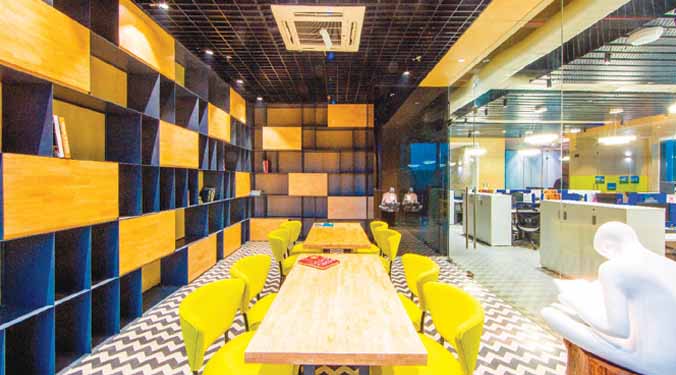
Our design gave the utmost importance to functionality, cost-effectiveness, durability, maintainability, compatibility, creativity, flexibility, sustainability, and timelessness. Work floors have a rustic-modern character with the juxtaposition of cement-look tile, handmade cement floor tiles, slate veneer, E-board, handmade ceramic mosaic tiles, etc. An exposed ceiling with an open-cell metal false layer to conceal services, an E-board backdrop in the walls, zig-zag handmade cement tile flooring, and lacquer glass give this room a neutral, calm, and minimal modern character that allows a person to concentrate. A reading man adds flavour to this room!
Since this is the office of a construction company, raw materials have been used to bring about their inherent character in the space. The breakaway room on the first floor breaks from the monotony of the workspace into a playful yet sophisticated colour palette to allow employees to catch a short break during the day. The unusual use of checkered aluminium plate in 2-level fixed seating with a coloured TMT bar jali screen backdrop gives this place a distinct personality.
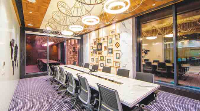
Comfort, luxury, and sophistication personified! Warm tones in materials have been used to make the director’s floor welcoming. Floor-to-ceiling panelling with an end-to-end black mirror ceiling enhances the volume of the entrance lobby and makes it seem smaller. The passage has a suspended metal chandelier that covers the entire area and binds this transitional space together.
A low-cost and comfortable place, simple enough to allow people to unwind as desired, and all our design decisions reflect just that! Mutually reflecting linear wrap-around lines in the ceiling and floor hold the space together, and exploding colour graphics and complementing furniture add verve to this space.
for more info visit : http://www.designcosmos.in/
Cookie Consent
We use cookies to personalize your experience. By continuing to visit this website you agree to our Terms & Conditions, Privacy Policy and Cookie Policy.
