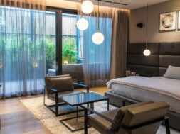
Material diversity, its application and adaptation defines this project

Sameer and Shilpa Jain Balvally, Founder Partners, Studio Osmosis, speak about one of their most magnificent projects located in one of the most premium projects of Mumbai city – The Lodha World Towers, Lower Parel
Where is this project located?
The project, a 2 BHK apartment is located in Mumbai’s prominent luxury high rise residential building- The Lodha World towers, Lower Parel. Having worked at the Lodha World Crest before, the Lodha team recommended us to the client who had just taken possession of their home. We shared our ideas for their apartment which were coherent with their requirements and we had the opportunity to work with them on this prestigious project. Elegance is being able to create a space that is classy yet simple. It makes the space mature, and sophisticated while still making it approachable.
What was the client brief when he approached you with the project? Accordingly what was the design strategy you adopted
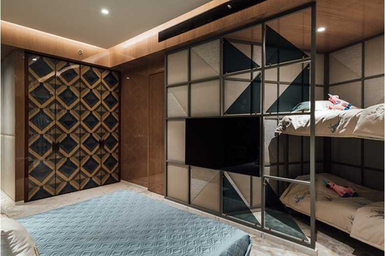
The entrance door was shifted from its initial location by knocking off the servant’s room and the servants toilet. The demising wall in between the living room and the kitchen was also demolished to further make room for the open and interactive kitchen with an emphasis on a breakfast island. The three bedrooms were converted into two giving a larger master bedroom with a walk-in closet and an elaborate bathroom while the guest bedroom was maintained compact. The access to these rooms was maintained by the existing corridor Design is collaborative. We had multiple design sessions with the client. We understood their lifestyle, the cultural influence and their interpretation of luxury which was a crucial influence and stimulus for conceptualising their abode. Understated luxury was the driving concept for the project. The house exemplifies sophistication, in the form of rich materials with bold yet modest patterns composed with a sense of proportion, balance and minimalist elegance. Every detail and need had been thought out and designed to take the concept to the next level of luxury, practicality and optimization.
How easy or difficult was it to achieve the desired level of segregation in this project? How many dedicated spaces are there in the project?
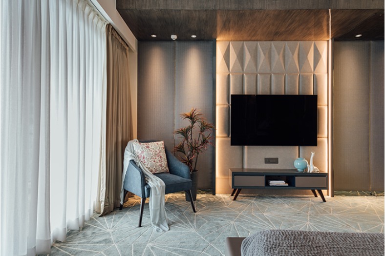
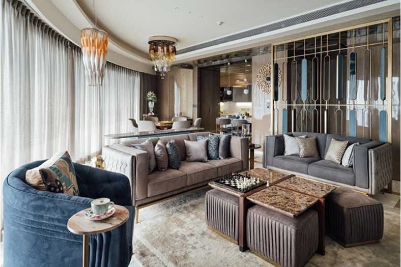
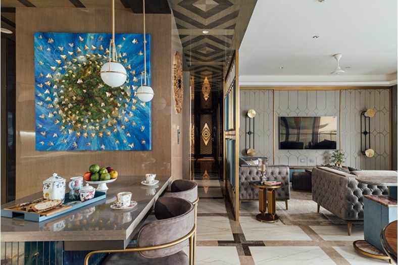
In this project, having an open kitchen with an added foyer with an improved entry location required some alterations to be done in the base layout. The servant’s bathroom and Servants room were knocked off along with the demising wall that separated the living and the kitchen areas. The only obstruction was the building internal shaft which was used to our advantage and treated with patterned mirror transforming the scale of the foyer area. All storages were planned along the walls keeping the entrance and kitchen area clutter free. Similarly having two bedrooms carved out of three meant demolishing one bedroom and one bathroom. Maintaining the services lines of the building, we could carve out adequate storage along the shaft walls located in the long corridor wall. All the shutters were concealed and designed to blend into the panel design. These hidden storages make the house seem bigger with minimal furniture pieces around the house.
What are some of the key materials used and colour scheme adopted in the dedicated and the common areas (including flooring and walling)?
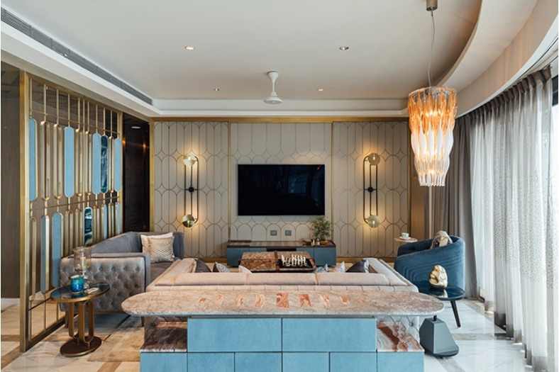
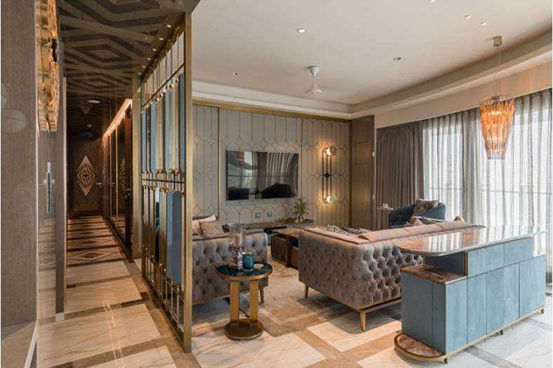
Material diversity, its application and adaptation defines this project. Marble has been extensively used throughout the flooring, which has been laid with contemporary inlay patterns. High gloss polyester finishes have been applied on the veneer, which is well-adjusted with softer fabric wall cladding. Metal inlays break the monotony while adding finesse to the wall surfaces. Wall to wall carpeting in the bedrooms makes them plush and warm. Patterns are the high point of the design which can be seen throughout the house. Every material is used in various patterns and carefully laid as to not be boisterous but visually tie the spaces together. The world towers interiors have been designed by Armani Casa. We wanted the design principle of the home to be an extended arm of the tower yet a few notches ahead in the drama and story. The intention was to be intricate in detail and materials as well as textures which are used in a complex manner yet exemplifying a serene balance. We wanted to enhance the sense of space with a harmonious colour palette of neutral colours augmented with detailed furniture, wall cladding and custom lighting.
What were the challenges you faced while designing the luxury
Like most luxury projects with free hands on design, this one inspired us to work with unique materials. These often entailed lead time to experiment, detail, make endless mock-ups, process and execute. It was challenging and time consuming to get the entire process right, in the end to see all these elements fall into place as they come together to form one cohesive design. Design comes together successfully when the material chosen for the design reacts unequivocally. Design needs to be tweaked due to material workability limitations, expertise or simple logistics. The key is to collaborate with the right people to understand the problems and find viable solutions. Whether it is customizing lights, getting the paint shade and textures correct or getting the detail of that door handle correct. Also, getting uniformity on a larger scale with the best quality in mind is challenging compared to small samples that get approved especially if the job is labour/ handwork based. It’s a home inspired by a new palette for interior designing, arresting artworks, and an interplay of texture.
How much ambient light does this project receive? What kind of lights have been utilized for artificial illumination?
Design comes together successfully when the material chosen for the design reacts unequivocally. Design needs to be tweaked due to material workability limitations, expertise or simple logistics. The key is to collaborate with the right people to understand the problems and find viable solutions. Whether it is customizing lights, getting the paint shade and textures correct or getting the detail of that door handle correct. Also, getting uniformity on a larger scale with the best quality in mind is challenging compared to small samples that get approved especially if the job is labour/handwork based. The way the whole space opened up with respect to the planning after breaking down the walls and opening up the kitchen which itself was a elegant and chic space eventually creating an interesting social interactive connecting space in between. Also, how interesting materials like the corridor glass combined with a beautiful flooring and ceiling pattern can break the monotony of the length ending into a lovely visual of a door and the perfect lighting mood. Initial reaction to having completely patterned carpeted flooring in bedrooms came as a surprise, but its turns out to be a welcome softness to the whole space adding warmth and actual comfort and balances the neutrality well.
Cookie Consent
We use cookies to personalize your experience. By continuing to visit this website you agree to our Terms & Conditions, Privacy Policy and Cookie Policy.


